Friday 4 June 2010

Final Major Project Evaluation.

Final Major Project Evaluation:

For my final major project I stated that I wanted to focus on the uses of type and layout with a main focus on image. Looking in to design for publication such as book cover design for large publishers like Penguin. Through out my final major project I wanted there to also be a main focus on all things print and the uses of the different print processes, as this is also a large part of my overall design practice. Looking in to design for publication will allow me to combine the uses of both type and image so that I can also improve my layout skills. I also wanted to investigate more into brand identities for small independent companies and to continue to experiment with print processes. Within the final major project module I also aimed to work a professionally as possible, which meant a quick turn around of my work, consideration of audience and context, appropriateness of print processes and finishing’s.

The final briefs that I handed in for this module are, Puffin Classics re-design, Fairfax Singers brand identity, Postage stamps, Proverb Posters and Paper product – wedding invites. I intended to do the British Music Experience brief but found it wasn’t appropriate for my design practice.

For the Puffin books re-design I initially took on the competition brief set by Puffin to re-design the cover for Alice’s Adventure’s in Wonderland. However this brief then expanded to a whole set of books, from the children’s classic range selecting 5 from that range to re-design. As a whole I really enjoyed this brief and got to look in to the uses of processes such as foil blocking with the heat press, to highlight areas of the text on the covers. Although within this brief I tended to fall in to the trap of changing little bits of the book layouts and not making design decisions early on. However I was happy with the overall final designs and put the books in to context by creating in store banners and promotional book marks for them. It was also suggested to me to look in to ebooks and other applications other than just the book itself.

The Fairfax Singers was a live brief that I took on and it was a paid job too. The Fairfax Singers are a local choir and they wanted to update their stationary and logo. The turn around for this brief was quite quick but it was just the decisions on their part I had to wait for. I produced several presentation boards to show them my designs and then they would give me feedback on which ones they thought worked best and then I would take those ones further. The initial brief was to create just a logo for them but it turned in to letter heads, business cards and promotional posters for their up and coming events. I learnt a lot from this brief and found out that it is very hard to please people sometimes when you’re dealing with a group of people.

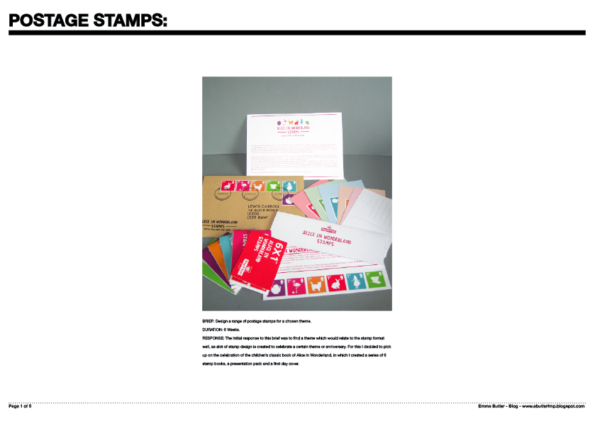
The postage stamp brief allowed me to work with a slightly different format to apply illustration to. With this brief I was able to work more with illustration and colour creating a range of products.

For the proverb posters brief I initially wanted to have the posters as a screen-printed outcome. Within this brief I was able to experiment more with the process of screen-print and the uses of different stocks. Also this brief was centred around type and image as I wanted to improve my skills within layout.

For my final brief I chose to do paper product using the theme of a wedding to create wedding invites, thank you cards and RSVP’s. This was a quick turn around brief and I didn’t want to spend too long on as it, so I benefited from this as most of the time I don’t spend enough time on making design decisions.

Thursday 27 May 2010

Final crit ever!!!

Today was the final crit ever!!! and the main focus of the crit was to look at the presentation of the work on boards. The feedback I got was...

FMP
  • That the titles on my boards were too big.
  • consider portrait layout.
  • consider putting fairfax singers into an ad for a magazine.
design context:
  • experiment more with format on posters.
  • look at using overlays with the text and image.
  • could incorporate style of studio to the format and layout of the poster.
So I've taken all this on board and I'm going to re look at the layout for my boards and my design context posters.

Friday 21 May 2010

product shots...

This week I have been re photographing everything for my presentation boards and just maybe I think my photography skills are improving slightly too.

Thursday 20 May 2010

Final Wedding invites.

Above is the final outcome for my wedding brief. The invites have been printed using a two colour screen print on to a wine coloured stock. The thank you card has been digitally printed using watercolour paper as it has a lovely quality to it and is quite a heavy stock.

Monday 17 May 2010

final printed thank you card.

thank you card.


keeping in with the same colour way as the invites but i am going to digitally print the card.

silver and white invites

here i have tried to overprint using a silver ink, it has quite a nice effect but you can hardly see it so the top part of the design doesn't really make any sense. but if the light catches it you can see it better.


here i have teamed the invite up with an ivory envelope but i think i the other colour way works better.

Sunday 16 May 2010

final layout for invite.

more invite devel.

I have decided that the final invite will be a two colour screen print so I have just been experimenting with different colour ways. But I think at this stage I will go with the deep aubergine colour as it seems more appropriate for my theme.

invite devel.

for the invite i wanted to keep the layout quite simple so that it would work well with screen printing so i could do a two colour print. the typefaces iv used so far are ok but i still want to develop it further...

Saturday 15 May 2010

postcards and cards...

Above are the mini versions of the proverb poster set.

And above again are some screen printed cards on to water colour paper. Screen printing them has mean I can use silver/gold inks and you achieve a really nice texture to the cards awell with them been screen printed but I think digitally printing them would perhaps work better?!?!

Final gift wrap.


Here are the final gift wrap designs for my proverb poster brief. These have just been digitally printed on to a double sided newsprint.

Final posters.

All the posters have been screen printed on to cartridge paper and will come packaged in a poster roll.

Friday 14 May 2010

E Books


This is a mock up of how my book covers would look as an e-book and below on an ebook website. Its an interesting way of reading a book but in my opinion you can't replace the actual physical copy.

Thursday 13 May 2010

sinking ships gift wrap


Out of the design so far I think that the type ones work better especially the horizontal type one (bottom left) this is a design that could work well for the whole range of proverb posters.

crit feedback....

Within this crit I really wanted feedback on my proverb poster brief as I wanted to know whether people thought the ones I had chosen were appropriate to work as cards.

The feedback I got was too...
  • keep all the fonts the same.
  • could adapt the posters to postcard format so that they are more practical.
  • check kerning within the type.
  • keep posters simple they work better that way.
  • expand on the proverb poster brief.

Wednesday 12 May 2010

Proverb gift bags.

Proverb posters card range.

I think as a card the posters work well, I think I need to work on the gift wrap but it works best by just using a repeating image.

mirri card...


I have been wanting to print using mirri card for ages so I thought that it would be appropriate for my proveb poster ' all that glitters is not gold'. Here I have printed on to the mirri card with a white ink with varying results. Overall it worked well and I could gain a nicely foil blocked look that would be better than using the heat press with foil. The only down side its that the ink will scratch off as the surface of the mirri card is glossy but if I were to use this as a method of producing this poster it would have to go straight in to a frame to protect it. But I think I will just stick to using a gold ink to produce the final poster

Monday 10 May 2010

Final first day cover.


This the final first day cover with vinyl cut stamps and screen printed date stamps. I think screen printing the date stamps has worked better than if they had been digitally printed and this would come as part of the collectors set.